Project Open Hand
Webpage Redesign
The Opportunity
In the client’s briefing, they requested to enhance its digital presence to better recruit new volunteers, especially for recruiting 1-time “hot spot” substitute volunteers to help out when they are short handed.
Summary
Project Open Hand is an organization in the Bay Area that helps improve health outcomes and quality of life by providing nutritious meals to the sick and vulnerable. This conceptual project explores the solution of netting more single day volunteers to help the community.
Problem
Volunteers need a way to easily see 1-time volunteer opportunities and schedule them in order to fulfill their desire to serve their community and empower organizations. Adapting the volunteer pages to make it more interactive and distinguishable is a solution worth solving to grow volunteer outreach.
Backed by Research
-
The research phase consisted of 1-on-1 interviews, card sorting, heuristic evaluation, and a survey that consisted of 5 participants to better understand a sincere perspective from real volunteers.
-
Through interviews and surveys, individuals were able to voice their concerns regarding time constraints to volunteer.
-
Card sorting brought to light the confusing terminology of certain phrases such as “Volunteer Hot Spot”. 4 out of 4 Participants struggled to place this phrase into a specific category due to its undefined terminology.
Assessing User Interface
Heuristic evaluation is a thorough assessment of a product’s user interface, and its purpose is to detect usability issues that may occur when users interact with a product and identify ways to resolve them.
Consistency and Standards:
Violation: Volunteer hot spot can be confusing for new people in terms of what it means.
Recommendation: Come up with a new term that can best describe what it is. Also, fit a description with the link stating that it is a 1-time volunteering position.
Match between the system and the real world:
Violation: Placement of volunteer hot spot on navigation bar is placed in an awkward spot.
Recommendation: Rearrange the information in an organized fashion and possible taking out some selections so that it can be better organized.
Violation: Volunteer hot spot link located at the bottom of the volunteer page when you click the button on the home page.
Recommendation: Move the link to a visible area on top of the page to allow quick and easy access.
Affinity Map Highlights
From using affinity maps, qualitative information was gathered and grouped into categories. It allowed for a deeper understanding of what needed to be changed or improved.
Meet and Greet
Give a warm welcome to Daniel. He is the persona that was derived from surveys and interviews to help maintain the course of finding a solution to increase one-day volunteer signup.
A 32-year old postgrad who works full time, Daniel has a passion and longing to serve in his community and be a positive influence to those around him. Due to his work and life schedule, he has had trouble finding an organization that allows a flexible volunteer schedule until he found Project Open Hand.
After several attempts through the webpage links, Daniel finally finds the one-day volunteer signup page and finally locks in a date to serve. How can we help Daniel in his future endeavors to volunteer?
How Might We…?
👓
HMW increase the visibility of the one-time volunteer page?
💻
HMW improve the terminology for visitors to better navigate through the page?
✍️
HMW redesign the signup page layout for an easier application process?
Site Map
On the left you’ll see the previous Navigation Bar and on the right the new navigation bar. The boxes highlighted in red have been omitted and the ones highlighted in black changed in placement and terminology.
We were able to dispel confusion and allow faster navigation towards the “1-Time Volunteer” page.
User Flow
In the original user flow, it shows two different ways of finishing the task of signing up for a volunteer position with the organization. Unfortunately, the alternate way of performing the task leads to a broken link. The reason for this is to show the confusion and frustration from performing a simple task. The redesigned user flow allows for easier navigation while providing vital information.
Design: Sketches and Wireframe
Design studio was conducted where all 3 teammates sketched their ideas and took the best features from each sketch to later produce a lo-fidelity wireframe. It was important to stay aligned with the needs and goals for Daniel as well as providing a solution to increase more “Hot Spot” volunteers.
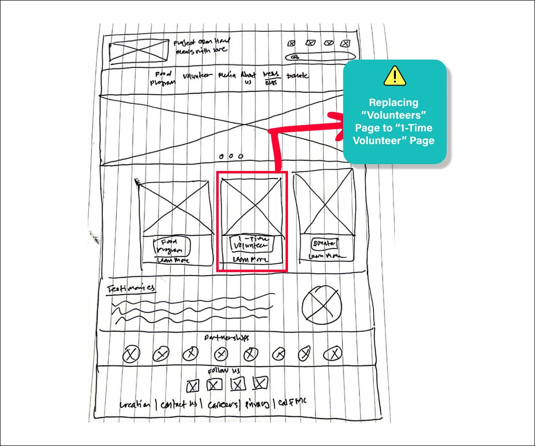
Landing Page: By replacing the "Volunteer" link to "1-Time Volunteer", it will lead to a higher rate of web traffic and a potential increase of volunteers.
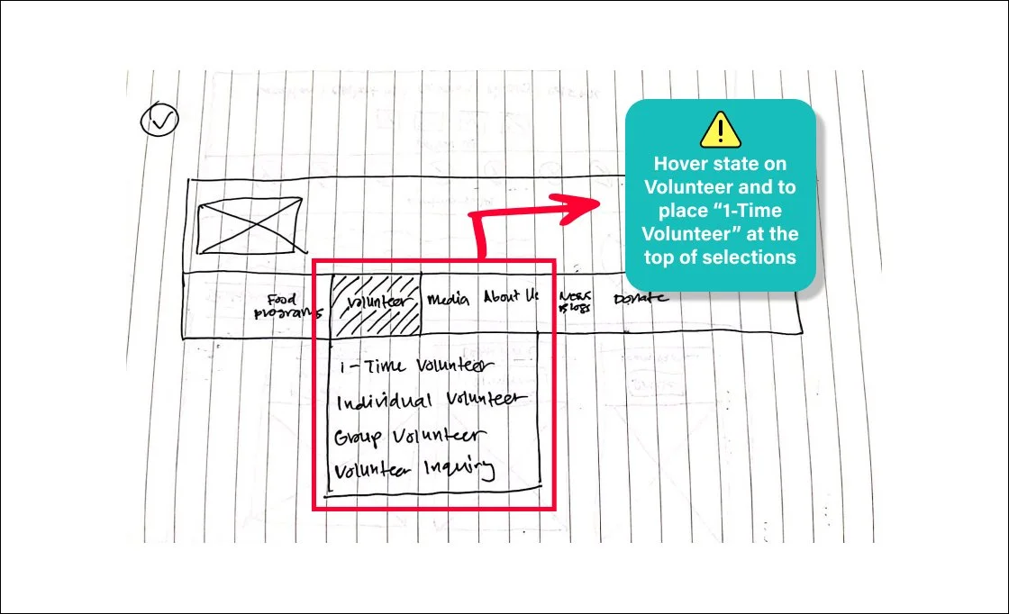
Navigation Bar: By placing the "1-Time Volunteer" link at the top of the secondary navigation, it will allow quick and easy access for individuals.

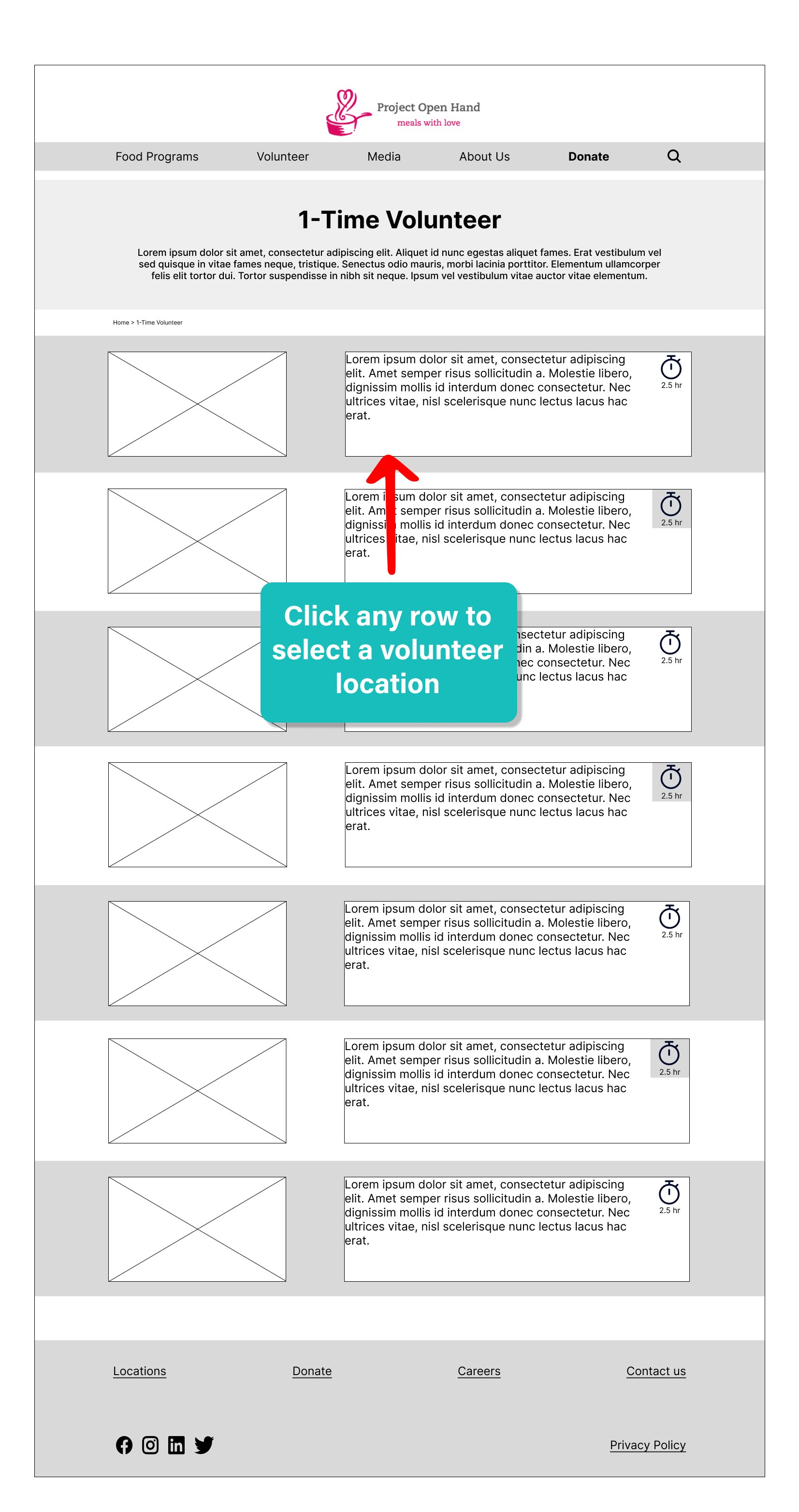
Volunteer Page: A clear list of the available opportunities will allow visitors to make an informed decision based on the time and location.
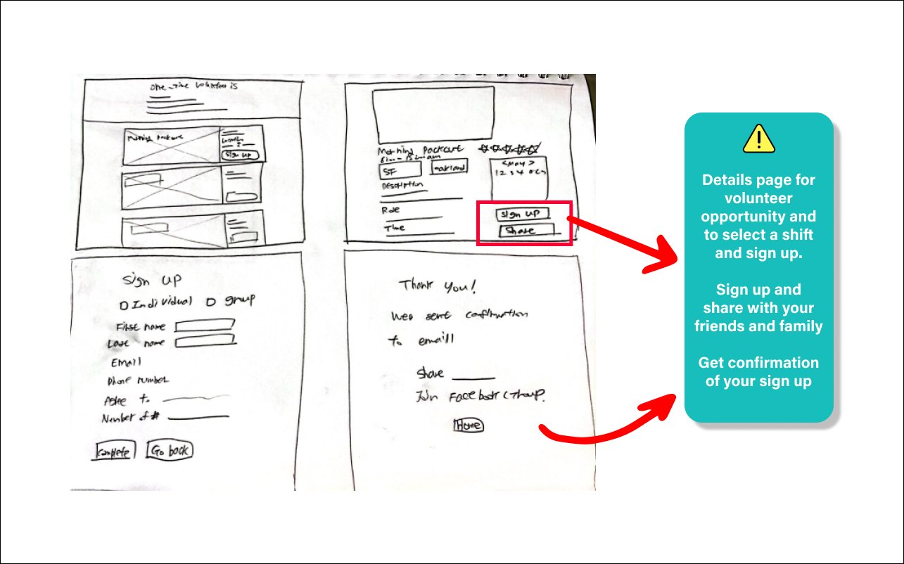
Details and Confirmation: In the details page, it gives individuals a clear availability schedule as well as the ability to share the upcoming opportunity via social media. Afterwards, they will receive a confirmation email of their time, date, and location.
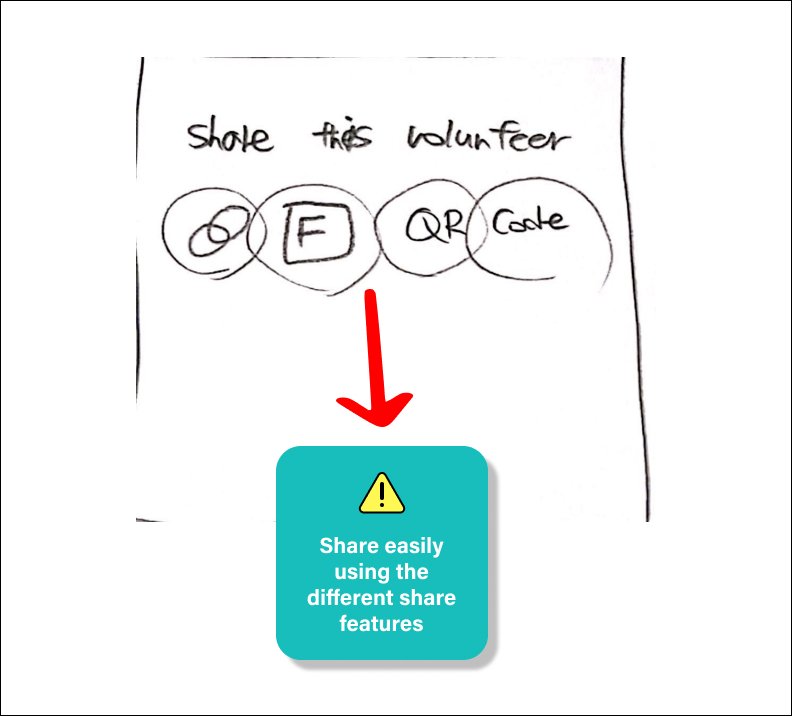
Share Feature: By having a share feature, individuals have the ability to share amongst their network and involve more people to participate in 1-time volunteer opportunities.

Landing Page
Volunteer Page

Details Page
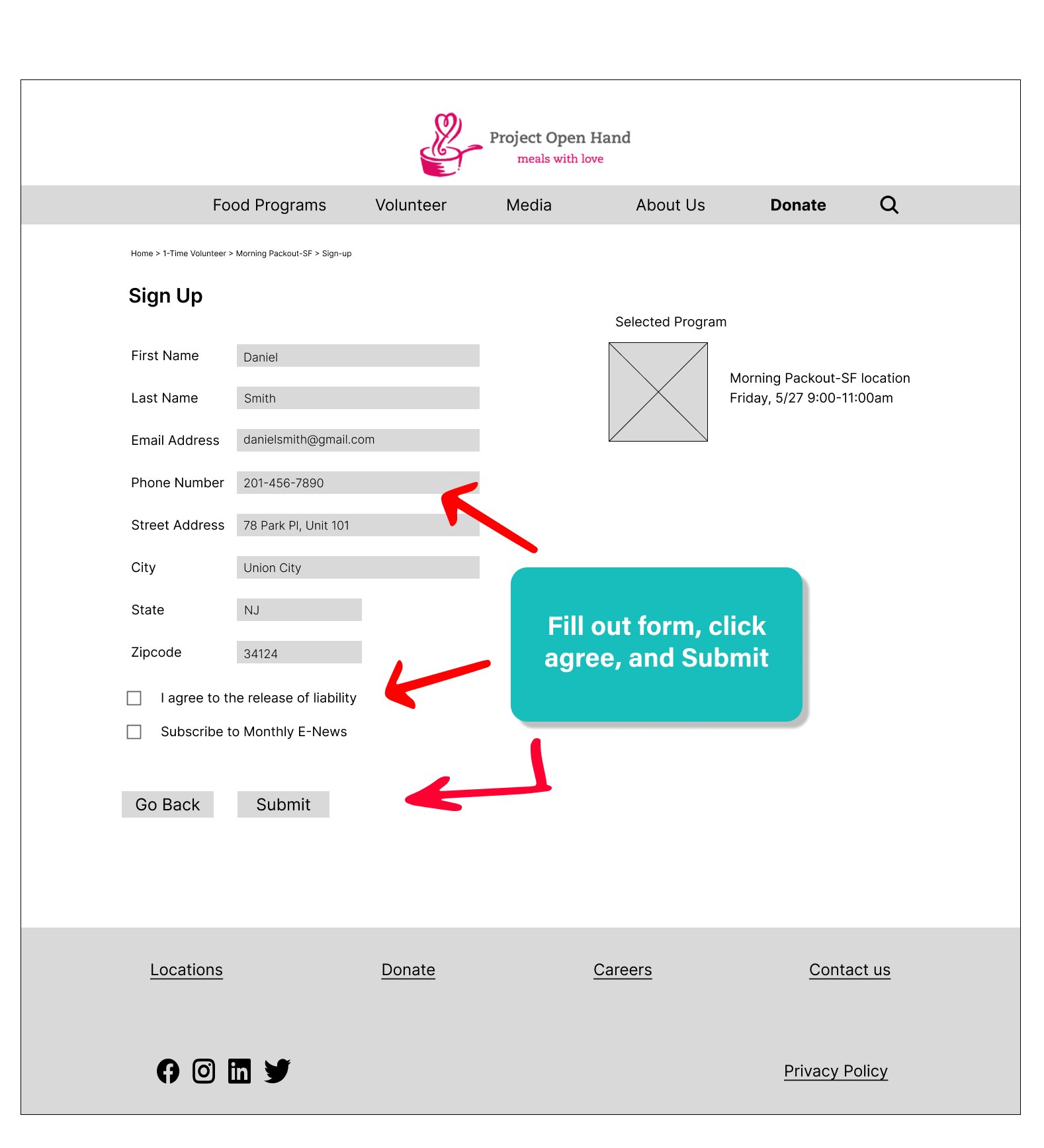
Sign Up Page
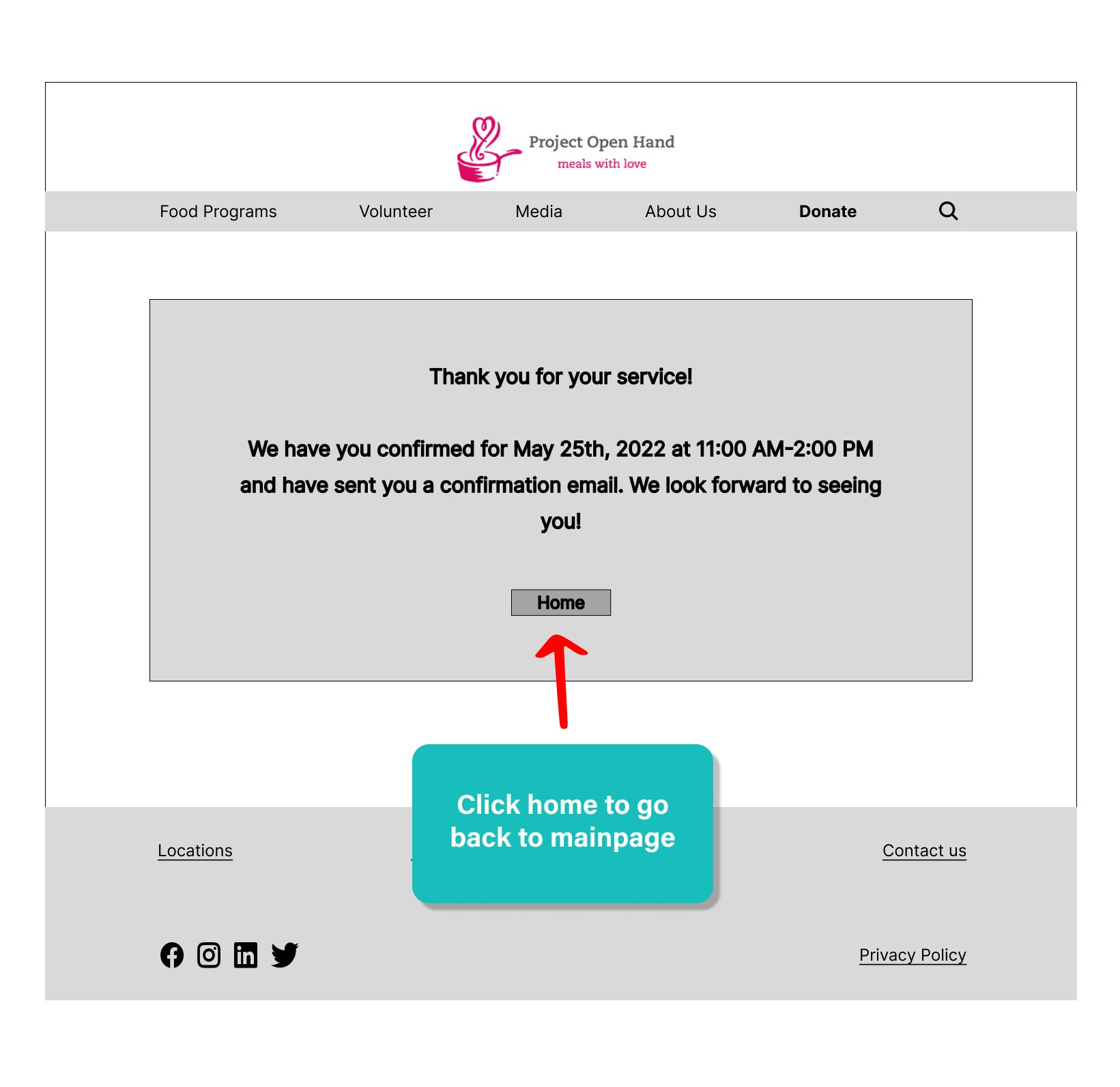
Confirmation Page
Project Open Hand Prototype
Next Steps
It will be useful to run card sorting a second time to see if participants are able to categorize and understand what one-time volunteer means.
Conducting usability testing will allow the team to see if visitors and returning volunteers are able to navigate and sign up on the 1-Time Volunteer page with ease.
Running a web analytics tool to see if there is an increase in web traffic and signups will be beneficial to the client.
Lessons Learned
In reflection, a more acceptable use of time would have been to conduct usability testing to confirm the solutions presented. Producing a mid-fidelity prototype rather than a high-fidelity would have freed up time and resources to conduct testing as well. This lesson will help me prepare for future projects by being able to discern which methods and processes are essential to formulating quality solutions.